Slider Macros for Confluence Server
This is the documentation for Server version of the application. If you're looking for the cloud version, see here.

>>> Macro Demo Page <<<
Available Macros
- Image Slider macro
Use the Image Slider macro to display multiple images in a simple and beautiful image slider.- Automatic (timed) or manual slider transitions.
- Customizable timing.
- Thumbnail navigation
- Fade or slide transitions.
- Content Slider macro
Use the Content Slider macro to slide through page content like text, links or even charts instead of just images.- Use as a news-ticker, tutorial presenter, with any content form any page.
- Maintain content without re-configuring the macro.
Note: All macros are fully responsive, mobile compatible, touch-enabled and support keyboard navigation.
Feature Highlights
Display all image attachments of a wiki page in a beautiful image slider.
- Image picker to select images that you want to be displayed.
Collect images from any space, page, filter by labels.
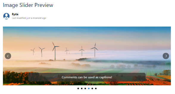
Use attachment comments as image captions.
Link images to the pages or blog posts they are attached to, e.g. to create a blogpost teaser on your dashboard.
Set responsive width to let the slider adapt to the available space automatically.
Choose from different transition effects, image fitting options.
Image Slider Macro
Display optional thumbnails with a single click:


Use the native Confluence comments to display captions for each image:

Use the Image Slider macro on a page to display selected image attachments from any space or page in a nice looking image slider.
Use attachment comments as image captions to display more information in the image slider. You can even link the images to the pages or they are attached to. There are also multiple transition effects you can choose from and lots of configuration options like image fitting, responsive or static width and height, gallery mode with thumbnails, different navigation types, etc. to adjust the image slider to your needs.
Image Slider Configurable Parameters
Configuration flexibility lets users decide the rate of transitions, the footprint on the page, and more:
| Parameter | Default | Description |
|---|---|---|
| Width | None - size of the first image will be used | Width of the slider in pixels or percents. Leave blank to let the slider automatically choose the best size. e.g. 100%, 500px |
| Height | None - size of the first image will be used | Height of the slider in pixels. Leave blank to let the slider automatically choose the best size. |
| Image Fitting | Stretch | Choose whether images should be stretched to fit or scaled from the center and cropped to fit. Values are:
|
| Sort Images By | Creation Date | The order the images should be sorted by. Values are:
Note: By default, sort is applied in ascending order. If you wish to change the order to descending choose the Reverse Order check box. |
| Reverse Order | Not Selected | Choose to sort images by descending order. |
| Filter Images By Date Range | Not Selected | Choose to filter the images based on a specific date range. Select the check box, and a calendar is displayed. Choose the start and end dates from the calendar to apply the filter. |
| Use attachment comments as | Caption | Choose whether attachment comments should be used as image captions or external links. Values are:
|
| Slider Effect | Fade | Choose between multiple transition effects. Valid values are:
|
| Auto Slide Display Time | 3000 | Time (ms) how long each image will be shown. 0 value turns auto slider off. |
| Link Images | Not Selected | Choose to link images to either the pages they are attached to or URLs specified in Attachment Comments. Use Attachment comments as must be set to Link or Caption and Link to link the URLs specified in attachment comments. |
| Show Navigation | Selected | Choose to show prev/next navigation. |
| Show Thumbnails | Not Selected | Choose to show thumbnails of the images at the bottom of the slider. |
| Show Bullets | Selected (if thumbnails are disabled) | When thumbnails are disabled, choose to show bullets at the bottom of the slider. |
Content Slider Macro
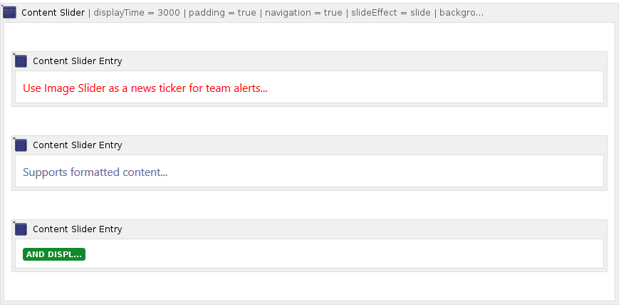
The content slider lets you create each slide in a container, with full Confluence editing and formatting functionality:
Use the content slider macro to slide through page content like text, links or even charts instead of just images. Whether you want to create interactive step-by-step guides or just a simple news ticker, it's now possible with the content slider macro.
Place as many entries as you want inside a content slider macro block by using the content slider entry macro.
Content Slider Configurable Parameters
| Parameter | Default | Description |
|---|---|---|
| Width | 500px | Width of the slider in pixels or percents. Leave blank to let the slider automatically choose the best size. e.g. 100%, 500px |
| Height | 300px | Height of the slider in pixels. Leave blank to let the slider automatically choose the best size. |
| Background Color | whiteSmoke | Background color of the content slider. Use hexadecimal notation or HTML color name. |
| Slider Effect | Fade | Choose between multiple transition effects. Valid values are:
|
| Auto Slide Display Time | 3000 | Time (ms) how long each image will be shown. 0 value turns auto slider off. |
| Content Padding | selected | Enable to add padding to slide content. |
| Show Navigation | selected | Choose to show prev/next navigation. |
| Show Bullets | selected | Choose to show bullets at the bottom of the slider. |
Build a content slider with each slide as its own content container:
