Deprecated macros for Confluence Server
Available Macros
Image Slider macro (Deprecated)
Use the Image Slider macro to display multiple images in a simple and beautiful image slider.Gallery Slider macro (Deprecated)
Use the Gallery Slider macro to display an image gallery with thumbnail navigation.Content Slider macro (Deprecated)
Use the Content Slider macro to slide through page content like text, links or even charts instead of just images.
Note: All macros are fully responsive, mobile compatible, touch-enabled and support keyboard navigation.
Feature Highlights
Display all image attachments of a wiki page in a beautiful image slider.
Collect images from multiple pages or blog posts by label, even from different spaces.
Use attachment comments as image captions.
Link images to the pages or blog posts they are attached to, e.g. to create a blogpost teaser on your dashboard.
Enable responsive width to let the slider adapt to the available space automatically.
Choose from multiple different transition effects.
Guided Screenshots
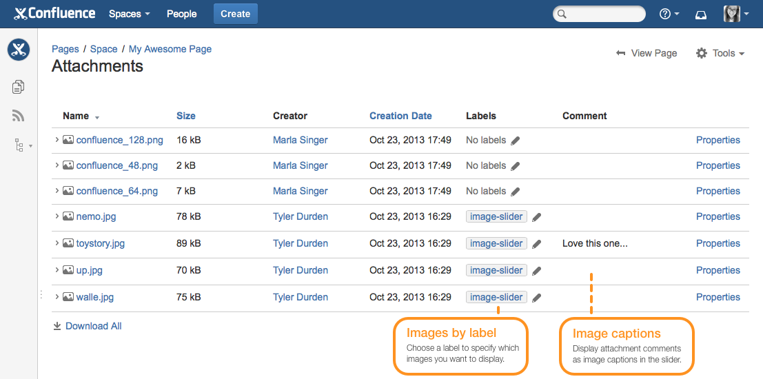
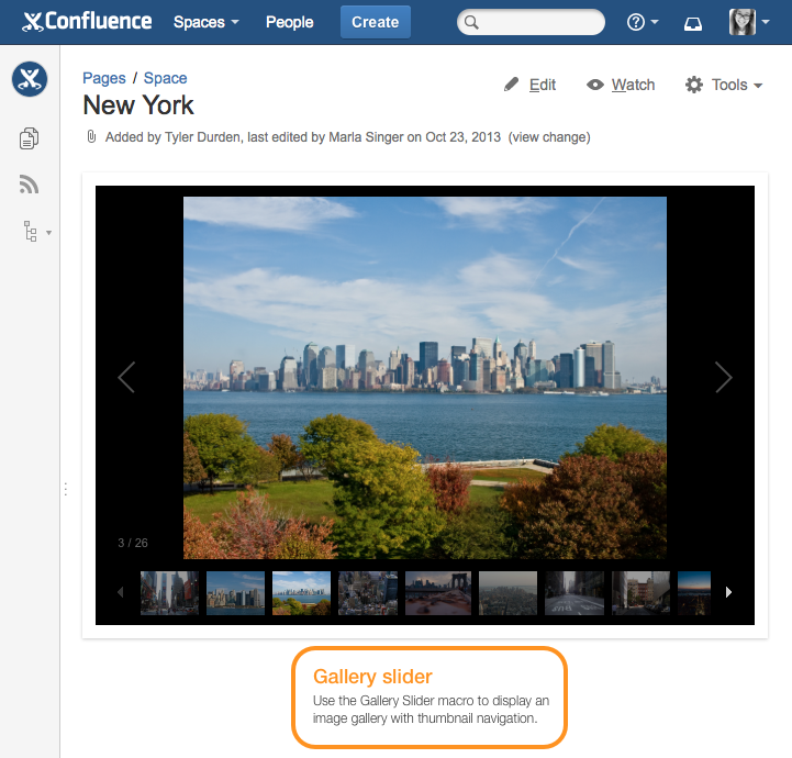
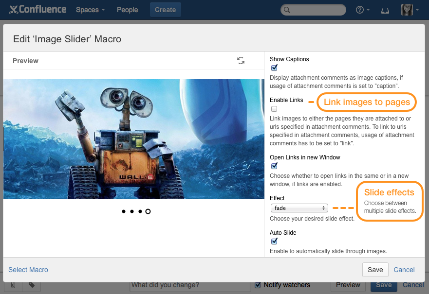
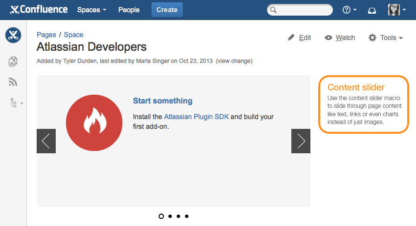
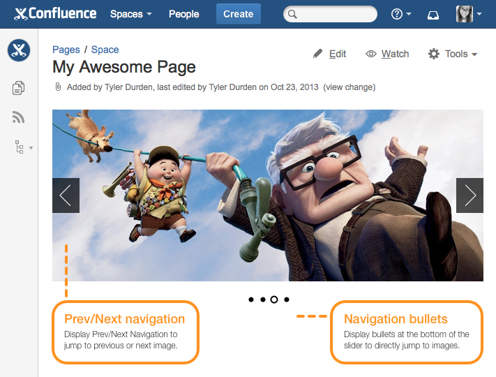
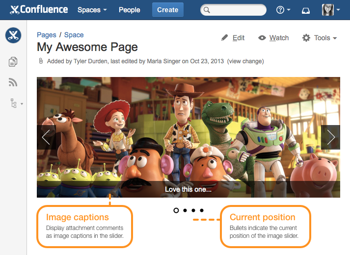
Image Slider Macro (Deprecated)
Macro is Deprecated. Replaced by new Image Slider Macro.
Use the Image Slider macro on a page to display all the image attachments of the current page in a nice looking image slider. You can also specify a label to collect attachments from multiple pages or blogposts, even from different spaces.
Use attachment comments as image captions to display more information in the image slider. You can even link the images to the pages or blogposts they are attached to, e.g. to create a nice blogpost teaser on your dashboard. There are also multiple transition effects you can choose from and lots of configuration options like responsive width, different navigation types, slide numbers, etc. to adjust the image slider to your needs.
Tip: Make sure all images are of the same size. If the images have different sizes, the image slider will use the size of the smallest image for all images.
Parameters
Parameter | Default | Description |
|---|---|---|
Width | None - size of the smallest image will be used | Width of the slider in pixels. Leave blank to let the slider automatically choose the best size. |
Responsive Width | false | Enable to let the slider adapt to the available space. This will override any custom width. |
Height | None - size of the smallest image will be used | Height of the slider in pixels. Leave blank to let the slider automatically choose the best size. |
Attachment Labels | None - images of current page will be displayed | Filter images by one or more attachment labels. Leave blank to use images attached to current page. Example: blue,green,-redwill display all images with labels blue or green, excluding those labeled red. |
Spaces | None - if any label is specified, images from all spaces will be displayed | Comma separated list of space keys to restrict searching of images, if any label is specified. Use @self for current space. Leave blank for all spaces. |
Pages | None - if any label is specified, images from all pages will be displayed, otherwise images of current page will be displayed | Comma separated list of pages to restrict searching of images. Use @self for current page. To specify a page in a different space, use the following syntax: SPACEKEY:Page Title |
Sort Order | creationDate | The order the images should be sorted by. Valid values are:
|
Reverse Order | false | Enable for reverse ordering. |
Max Images | None - no limit | Maximum number of images to be displayed. Leave blank for no limit. |
Comment Usage | caption | Choose whether attachment comments should be used as image captions or external links. Valid values are:
|
Show Captions | always | Choose whether you want to display attachment comments as image captions in the slider. Comment usage has to be set to "caption" or "captionAndLink". Valid values are:
|
Enable Links | false | Enable to link the images to the pages or blogposts where they are attached to. To link to external urls set comment usage to "link" and specify the url in the attachment comment field. |
Open Links in new Window | true | Choose whether to open links in the same or in a new window, if image links are enabled. |
Image Fitting | stretch | Choose whether images should be stretched to fit or scaled from the center and cropped to fit. Valid values are:
|
Effect | fade | Choose between multiple transition effects. Valid values are:
|
Auto Slide | true | Enable to automatically slide through images. |
Display Time | 3000 | Time (ms) how long each image will be shown. |
Pause on Hover | true | Enable to stop animation while hovering over the image. |
Show Timer | false | Enable to show slide countdown timer, if auto slide is enabled. Not supported in Internet Explorer. |
Reset Timer on Click | false | Enable to reset timer on click, if auto slide is enabled. |
Show Navigation | onHover | Choose to show prev/next navigation:
|
Show Bullets | always | Choose to show navigation bullets below the slider:
|
Show Slide Numbers | false | Enable to show slide numbers. |
Gallery Slider Macro (Deprecated)
Macro is Deprecated. Replaced by Image Slider Macro
Use the Gallery Slider macro to display an image gallery with thumbnail navigation.
Parameters
Parameter | Default | Description |
|---|---|---|
Width | 600 | Width of the slider in pixels. |
Responsive Width | false | Enable to let the slider adapt to the available space. This will override any custom width. |
Height | 400 | Height of the slider in pixels. |
Attachment Labels | None - images of current page will be displayed | Filter images by one or more attachment labels. Leave blank to use images attached to current page. Example: blue,green,-redwill display all images with labels blue or green, excluding those labeled red. |
Spaces | None - if any label is specified, images from all spaces will be displayed | Comma separated list of space keys to restrict searching of images, if any label is specified. Use @self for current space. Leave blank for all spaces. |
Pages | None - if any label is specified, images from all pages will be displayed, otherwise images of current page will be displayed | Comma separated list of pages to restrict searching of images. Use @self for current page. To specify a page in a different space, use the following syntax: SPACEKEY:Page Title |
Sort Order | creationDate | The order the images should be sorted by. Valid values are:
|
Reverse Order | false | Enable for reverse ordering. |
Max Images | None - no limit | Maximum number of images to be displayed. Leave blank for no limit. |
Comment Usage | caption | Choose whether attachment comments should be used as image captions or external links. Valid values are:
|
Show Captions | true | Enable to display attachment comments as image captions in slider. Comment usage has to be set to "caption". |
Toggle Captions | true | Choose whether you want to display image captions permanently or allow users to toggle them. |
Enable Links | false | Enable to link the images to the pages or blogposts where they are attached to. To link to external urls set comment usage to "link" and specify the url in the attachment comment field. |
Open Links in new Window | true | Choose whether to open links in the same or in a new window, if image links are enabled. |
Effect | fade | Choose between multiple transition effects. Valid values are:
|
Auto Slide | true | Enable to automatically slide through images. |
Display Time | 5000 | Time (ms) how long each image will be shown. |
Stop on Interaction | true | Stop playback when user has clicked on thumbnail or navigation, if auto slide is enabled. |
Background Color | black | Background color of the gallery slider. Use hexadecimal notation or HTML color name. |
Show Navigation | true | Choose to show prev/next navigation. |
Show Slide Numbers | true | Enable to show slide numbers. |
Content Slider Macro (Deprecated)
Macro is Deprecated. Replaced by Content Slider Macro
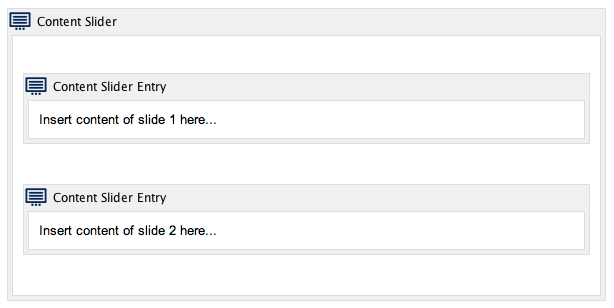
Use the content slider macro to slide through page content like text, links or even charts instead of just images. Whether you want to create interactive step-by-step guides or just a simple news ticker, it's now possible with the content slider macro.
Place as many entries as you want inside a content slider macro block by using the content slider entry macro:
Parameters
Parameter | Default | Description |
|---|---|---|
Width | 500 | Width of the content slider in pixels. |
Responsive Width | false | Enable to let the content slider adapt to the available space. This will override any custom width. |
Height | None - height will be determined by aspect ratio | Height of the content slider in pixels. Leave blank to use aspect ratio instead. |
Aspect Ratio | 16x9 | Choose your desired aspect ratio. Valid values are:
|
Background Color | whiteSmoke | Background color of the content slider. Use hexadecimal notation or HTML color name. |
Effect | fade | Choose between multiple transition effects. Valid values are:
|
Auto Slide | true | Enable to automatically slide through content entries. |
Display Time | 3000 | Time (ms) how long each slide will be shown. |
Pause on Hover | true | Stop animation while hovering, if auto slide is enabled. |
Show Timer | false | Enable to show slide countdown timer, if auto slide is enabled. Not supported in Internet Explorer. |
Reset Timer on Click | false | Enable to reset timer on click, if auto slide is enabled. |
Show Navigation | onHover | Choose to show prev/next navigation:
|
Show Bullets | always | Choose to show navigation bullets below the slider:
|
Show Slide Numbers | false | Enable to show slide numbers. |
Content Padding | true | Enable to add padding to slide content. |